Get Thunderbird Donate
featured post title image

Thunderbird For Android Preview: Modern Message Redesign

The road to bringing you a great Thunderbird email experience on Android devices begins with K-9 Mail, which joined our family earlier this year. And we’ve been busy improving K-9 Mail as we prepare its transition to Thunderbird for Android in Summer 2023. (Check out our roadmap for updates!)

Last week we showed you the new Swipe actions in K-9 Mail 6.400. Today, it’s something even more exciting: a completely redesigned message view! 

Preview: K-9 Mail’s Redesigned Message View

First, a short disclaimer: the redesigned message view is a work-in-progress. That means the mock-ups you’ll see in this post will inform the final design, and they’ll improve as development progresses. But if you have feedback, we’d love to see it! You can always join our Android Planning mailing list and contribute to the discussion.

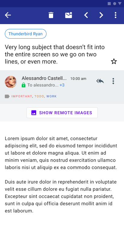
OK, here is K-9 Mail’s current message view:

K-9 Mail: Current Message View
K-9 Mail Message View (Current, Light Mode)

It’s clean and readable, but we can do more to help you stay organized and to highlight key information at a glance.

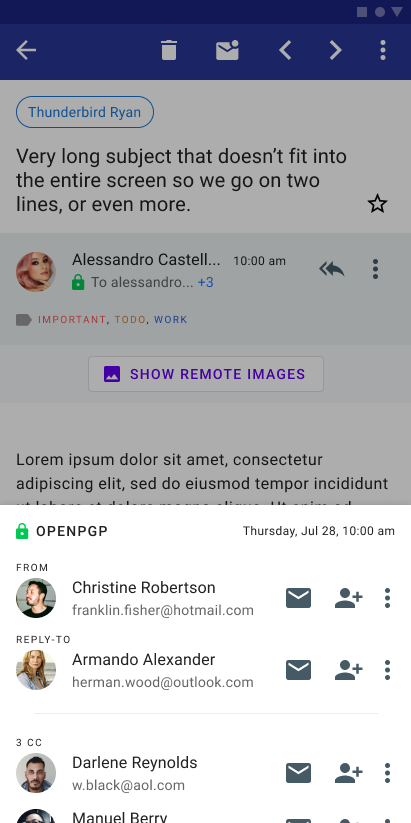
Here is our direction for the updated message design:  

Redesigned message view for Android version of Thunderbird
Redesigned message view for Android version of Thunderbird (bottom sheet with more message details)
Redesigned message view for Android version of Thunderbird (bottom sheet with additional message details)

There are several new UI elements to point out in the screenshots above. Let’s do a list outlining the new look, and then we’ll summarize everything with two annotated screenshots below.

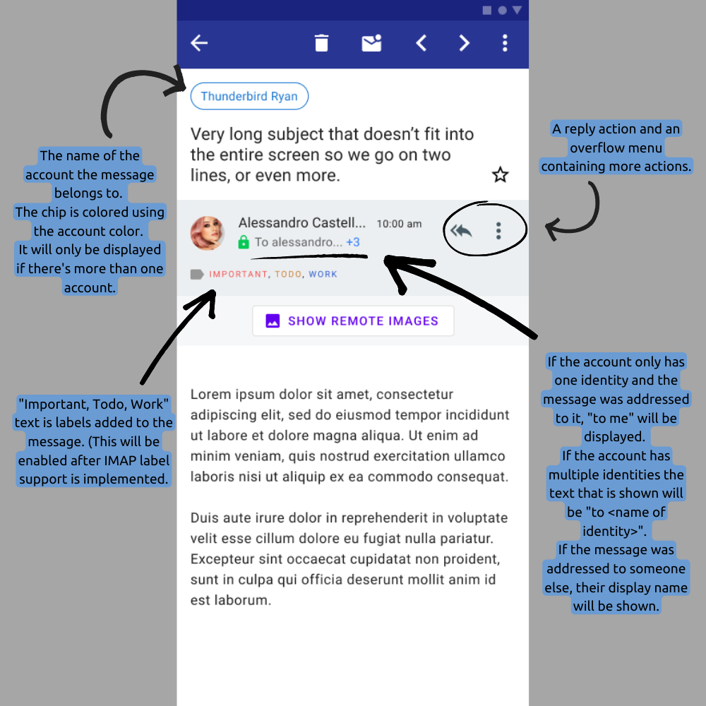
Left Screenshot (Message View)

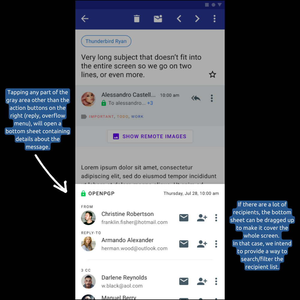
Right Screenshot (Bottom Sheet / Detail Overlay)

Those Screenshots Again, With Notes:

Let’s bring it all together with another look at these two screenshots of the redesigned message view, but annotated to call out some of the new features and UI elements:

Redesigned message view (annotated)

As cketti and the team continue to improve and polish K-9 Mail on the road to Thunderbird for Android, we’ll keep you posted with key updates.

Join The Beta, Experience Thunderbird on Android First

If you want to experience the newest features and visual improvements first, and help us test it all in the process, consider joining the ongoing K-9 Mail beta. You’ll see Thunderbird for Android taking shape!

Here’s where you can get the releases:

GitHub releases → We publish all of our releases there. Look for the “Pre-release label” that identifies a beta version.

Play Store → You should be able to join the beta program using the Google Play Store app on the device. Look out for the “Join the beta” section in K-9 Mail’s detail page.

F-Droid → Unlike stable versions, beta versions on F-Droid are not marked with a “Suggested” label. You have to manually select such a version to install it. To get update notification for non-suggested versions you need to check ‘Settings > Expert mode > Unstable updates’ in the F-Droid app.

19 responses

joe wrote on

the old UI was a lot clearer 😐 in the new one so much space is lost to “padding”. why can’t we see the full names of senders in the new one, but we can in the old? why move the timestamp up like that?

Jason Evangelho wrote on

Hey Joe! Sometimes we post current design mockups to get feedback just like this! Regarding name display, there’s already a pull request on Github to address this: https://github.com/thundernest/k-9/pull/6507

Regarding the padding, that will get tightened up. We must emphasize this is not an actual screenshot, but an early mockup design. Thanks for sounding off!

Jesse Vincent wrote on

You have no idea how happy this makes me.

As the guy originally responsible for the old UI, I was never all that happy with my design decisions. They were absolutely the best I could do in an era when maintaining compatibility with Android 1.5 was a priority, but those days are long gone.

Thank you all for the work you’re doing to modernize and improve K-9.

Leon wrote on

Looking great! I don’t mind the padding either (I see how it can be more balanced, but you already wrote it’s an early mock :))

My biggest UI complain: Accidentally scrolling 3 miles down in the message list when trying to star something.

And I’d love to have pinned messages. For my private mail I might even manage not to over-use it like I do at work :))

Ale wrote on

Looks very nice! Mind if I add my 2¢? Here’s what I came up with: https://u.ale.sh/tb-redesign-suggestions.png

– I’ve dropped the account pill, instead it is just a label now. It includes both account and folder name, and is still colored using the account color. (For better effect, you could color the navbar as well.)
– The navbar feels a bit cluttered, so no next/prev email buttons. I’m sure going back to email list and selecting the email should be fine for most cases. (For power users, we can allow enabling those in settings. We could add gestures, but it is a bit of an overkill.)
– Labels padding is a bit relaxed. Time now occupies the bottom right corner, which was empty. More space for recipients.
– Removed border around the “Show remote images” button. Instead, let it bleed to the whole panel (a trick I’ve first seen in the Telegram app). Less visual noise, better Fitts’ score (no need to precisely tap once you understand the whole panel is a button).

Hope this helps. Let me know what you think!

hum wrote on

Any plan on also adding matrix chat?

Jason Evangelho wrote on

Most likely not, as there are already great Matrix apps on Android (such as Element). With mobile apps, it’s best to just do one thing, and do it very well.

trustedtoast wrote on

I like the redesign a lot. A couple of suggestions though: Removing the arrows from the top navigation bar would free up space to put the account name in the top left, which would in turn free up more vertical space. Additionally I would leave the timestamp where it was, so the senders name is more legible.

Luks wrote on

Hi!
Are there any plans on moving navigation bar to bottom, as in the old version of K-9? Or at least giving us the option in the settings?
No important functionality should reside on the top part of the screen on today’s smartphones. They are too big to reach with the thumb 🙂

Jason Evangelho wrote on

We’ve heard the same sentiment from a lot of you in response to this, and I’ve shared your feedback with the team. Thanks!

roland wrote on

I agree fully with Joe comment (https://blog.thunderbird.net/2022/12/thunderbird-for-android-preview-modern-message-redesign/#comment-2909). @Jason cketti said that commenting github PR is wrong and we should talk about what we think in k9 forum. Could you update this blog post to link one place where we can share what we think about this suggested new UI?

Jason Evangelho wrote on

Hi Roland! It’s absolutely fine to provide feedback on this via the Topicbox discussion list that we linked to. The reason cketti said what he did in response to that user, is that person sent a very short, simple feature request, which is better suited for GitHub. But please, I encourage you to send your feedback. Please note that I’m also aggregating all feedback I see across social media into a private document for the team. Rest assured, the feedback is noticed and appreciated.

Ilya Zverev wrote on

Overall I love that you are working with the design. As a long-time user of K9, I see some issues with the new one.

Most importantly, shades: the contrast is too low, almost non-existent. Instead of a 100% contrast line, we’ve got a cyan line that is so bright, it almost merges with the white around it. So the entire screen looks like drops of text all over, without any layout. There are 5 left indents over 3 in the original screenshot.

Then, colors. Now we have four colors: black, grey, white, blue. The new design has at least eight. It’s hard to focus on the content when there is so much going on around it.

Though I like the increased line height and better “show images” button. Please do go on 🙂

Cello wrote on

I am so glad and thankful that the great K-9 Mail has gone into development drive again. For a while it looked as if it would not survive.

Daniel Kirsch wrote on

Loving the swipe feature and second the issue about Accidentally scrolling 3 miles down in the message list when trying to star something.

iopq wrote on

Please ALWAYS show the full email address front and center. That’s the #1 priority in decreasing phishing and scams.

Matthieu B. wrote on

I usually don’t comment, but as a product designer, I see a lot of UI/UX problems on those mockups and would love to help (I don’t know how though, if someone can show me the way…)
There’s a lot of wasted space, hierarchy of actions is weird… and they are all over the place. “Show remote images” takes a whole lot of space and shows as a vital primary action… which isn’t IMO.
Accessibility of color and spacing of elements is not good and inconsistent.

Jason Evangelho wrote on

Hi Matthieu, apologies for the late response. The best place to discuss our UI/UX out in the open is this mailing list: https://thunderbird.topicbox.com/groups/android-planning

Carles wrote on

I’m so happy to read this!

As a K9 + Thunderbird user I’m glad to see that this project is becoming real since it will be for certain a game-changing App in the mobile environment.

Based on @Ale suggestion, I would like to propose additional changes:
https://calaix.net/thunderbird_android.png

I think design is too complex: there are many colours around, buttons everywhere, etc. but it is a good start point.

Congratulations, the work is looking great!

Comments are closed.