Download Thunderbird Donate
featured post title image

Introducing The Brand New Thunderbird Logo!

Hello Thunderbird Family! After nearly 20 years, we are thrilled to share a completely redesigned Thunderbird logo that honors our history and vital connection to Mozilla, while carrying us forward into the next 20 years.

It’s no secret that after many years of being viewed as stagnant, Thunderbird is enjoying a resurgence. Our project is thriving with a renewed sense of purpose, and we see an invigorating energy bubbling up from our users, our community of contributors, and our core team. 

Just like the software, the current Thunderbird logo has seen small, iterative improvements throughout the last 20 years. But now the software is evolving into something more modern (while retaining its powerful customization) and we believe it deserves a fresh logo that properly represents this revitalization. 

But you should never forget your roots, which is why we asked Jon Hicks, the creator of the original Firefox and Thunderbird logos, to re-imagine his iconic design in light of Thunderbird’s exciting future. 

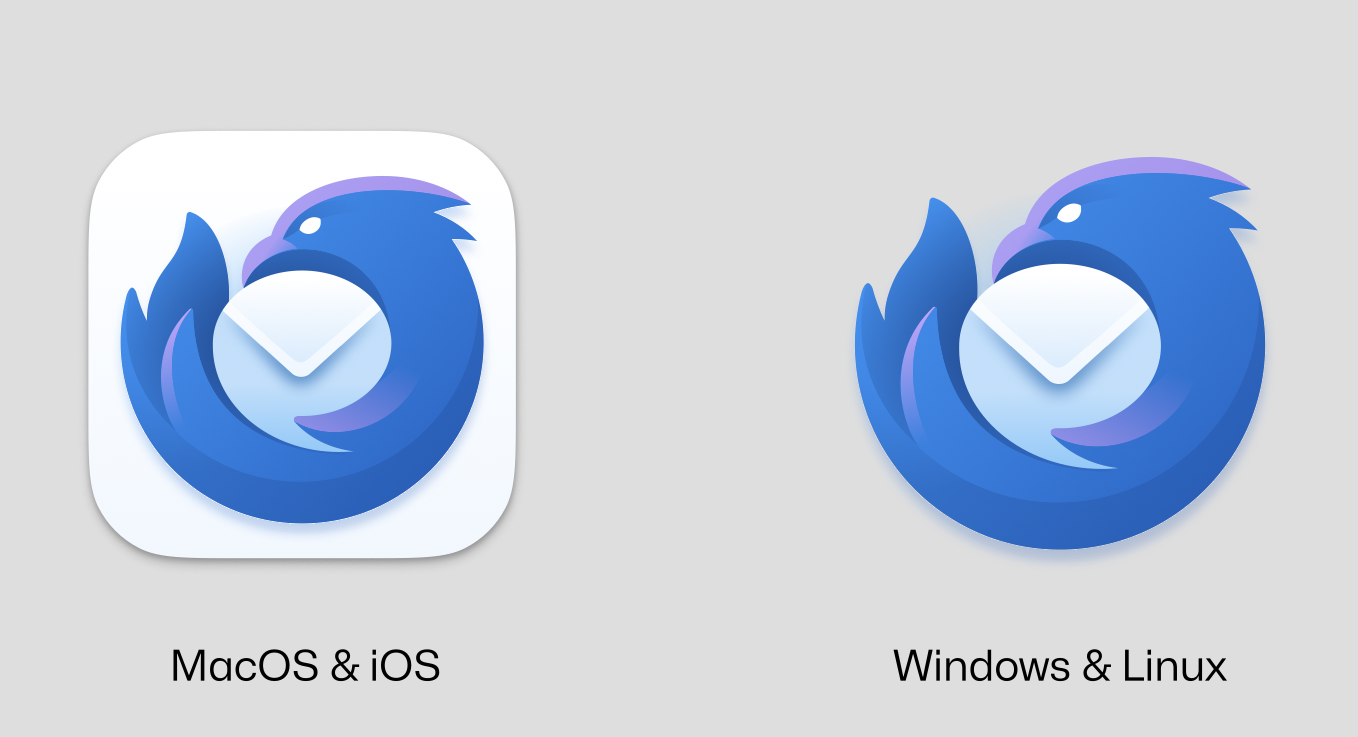
Here’s a look at our new logo across Linux, Windows, macOS, Android, and iOS.

The new logo for Thunderbird, with slight variations for different operating systems. It's  circular app icon resembling a blue elemental bird, wrapped around and protecting a white envelope.
Yes, we have officially added an iOS version of Thunderbird to our future development roadmap. Expect more concrete news about this toward the end of 2023.
The new logo for Thunderbird, with slight variations for different operating systems, pictured here for Android. It's a circular app icon resembling a blue elemental bird, wrapped around and protecting a white envelope.

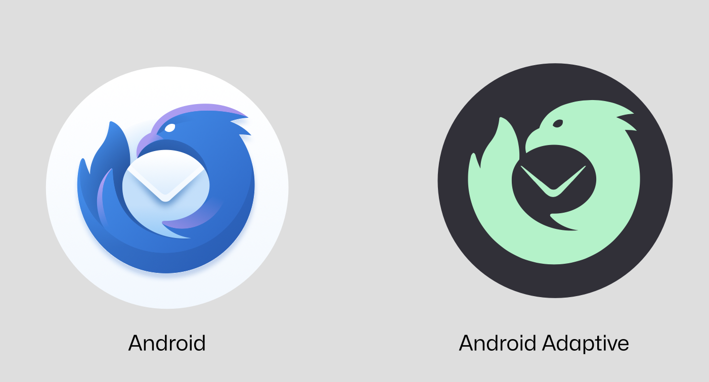
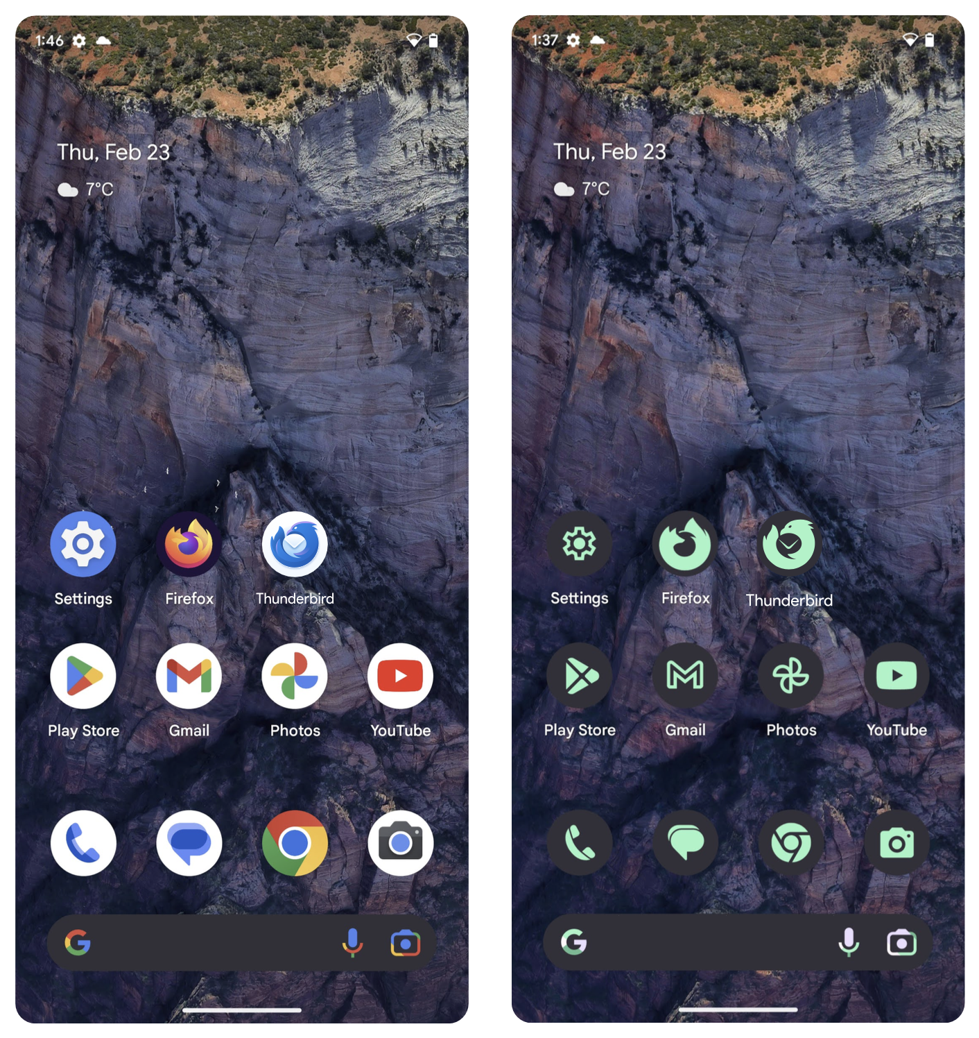
And here’s a glimpse of what Thunderbird for Android will look like on an Android device, sitting next to our best friend Firefox:

side-by-side screenshots of an Android device, highlighted by Thunderbird and Firefox logos.

When can you see it integrated with Thunderbird itself? Our plan is to incorporate it into Thunderbird 115 (code-named “Supernova“) this summer. During the next few months, we’ll also gradually redesign our website and update the branding on various social channels and communication platforms.

We understand that change can be uncomfortable, but we hope you agree this is a positive new look for the project. I encourage everyone to do what we did throughout this process: to live with the new design for a while. Let it breathe, let it sink in, and let us know what you think after a few days.

We all have a soft spot for the old Thunderbird logo (which I affectionately call the “wig on an envelope”), but our project is changing in big, positive ways, and we want to clearly show that to the world with a beautiful, revitalized logo and icon.

So here’s to a bright future! On behalf of the entire team: thank you for taking this journey with us. We wouldn’t be here without you.

Ryan Sipes
Thunderbird Product Manager


64 responses

Axel wrote on

My initial reaction was that I didn’t like it, but when I realized the similarity with the current Firefox logo, which I do like, my worries were abated. That the original logo designer (who also did Firefox’s logos, I was not aware of that) did this redesign is good to hear.

Keep up the great work, guys.

A Man of a Certain Age and Time wrote on

At first glance, it bugged me that the bird’s head isn’t “eye-level” with the fox in the Firefox logo (that way, it’d look like they’d be having a bit of a stare-down), but I understand that would likely interfere with the image of the envelope. Honestly, the more I look at it, the more I like it.

Walter wrote on

“Wig on an envelope,” lol – now I can’t unsee it!

I stumbled upon the February Thunderbird rebirth announcement today via a Reddit comment, which led me to this post from today. I’ve used Thunderbird a little in the past, and based on what I’ve read so far about the “Supernova” effort, I suspect I’ll be using it again in the near future. And while the old icon/logo definitely carries familiarity for me, I have to say…

This new logo looks great!

Going with the original designer was a good call, and I think he nailed the bridging of classic and modern. (Of course, it’s not the only possible way to reimagine it, so I look forward to seeing what variations the community comes up with, too!)

Stephen wrote on

Where can I find Thunderbird for iOS?

Jason Evangelho wrote on

Thunderbird for iOS is on our roadmap, but most likely won’t be delivered until 2024.

Jason Sneer wrote on

Using a white background and slapping the icon on top of that is just lazy… The adaptive icon exists for Android, which means that you can use a glyph on top of a colored background. Why go with the white background?

Jason Evangelho wrote on

Read the entire post? There is an Android Adaptive version.

Wolfgang wrote on

I think the new logo looks great! Already excited for the launch of Supernova and really looking forward to using it both on Windows and Android!

Wojtek wrote on

This looks awesome!

David Thomas wrote on

I love it.

Timo wrote on

Looks great. Thank you!

Stefan wrote on

You should listen Gandalf, my fellow friend

Tjark wrote on

I love it, too!

dcwd13 wrote on

rooster eats a letter

Vadim wrote on

Great icon refresh. Thank you!

Gianluca wrote on

I really appreciate everything you are doing for TB, changing the logo is a brave and deserved move 🙂

Zush wrote on

Why bird is so angry? Because of round-shaped envelope?..

Niklas B wrote on

Love it! Can we have the option on Mac OS to _not_ have the rounded square background? That trend need to go away.

Nido wrote on

I really like the new look. Gets in line with the new Firefox Browser Logo. But the original Idea still gets trough. Thanks a lot, I just get more and more excited for supernova 🙂

tux2bsd wrote on

The new logo looks really good. I don’t like the android adaptive one but the screenshot makes it appear that all the icons are given a horrid colour, not just the thunderbird one (i.e. android’s fault).

KP wrote on

The old one is pixel-perfect. I don’t like the new one.

Mitch Talmadge wrote on

I love it!! Great work on the new logo. Excited to see it in the updated versions.

jSeraph wrote on

I believe it is a very bold change and love the new design.

Especially the fact that the Envelop icon kinda looks like a messaging icon.

The strokes on the envelope fold in the Android adaptive icon could have been thinner.

Excited for the next Thunderbird!

Samuel Lampa wrote on

Looks great! I like that the bird itself is more visible now. Nice touch also with the envelope doubling as a speech bubble!

Jason Evangelho wrote on

Thanks for noticing that little detail!

Marcel wrote on

As many others commented on Twitter: why does that bird appear to be so angry or mean? To me the logo is bit too much like Firefox in blue. I like how it seems to signify that these days TB is more than just about sending emails but more about communication in general.

Jason Evangelho wrote on

Hey Marcel, I met with Jon (the designer) last night and we discussed this feedback. We’ve seen it a few times now, so we’re taking it into consideration. Thanks for sharing your feedback with us.

Josh wrote on

Is it summer yet?

NogNog wrote on

Why is the bird angry now?

Jason Evangelho wrote on

We’re hearing this from a few people, and taking that feedback into consideration. Thanks for sharing your thoughts.

Gastón S. wrote on

Very nice work! I love to see that there’s investment in revitalizing the app. I don’t mind the eyes, I don’t see anger but strength and an “attitude”. But if it comes as anger to many, it may be something looking into.
What I do see, is a watch pointing at 10:10 where the envelope is in the android adaptive version 😀
Am I alone on that one?

Jason Evangelho wrote on

Nope, you’re not alone on that!

Harsh wrote on

I use Thunderbird on ChromeOS and am really excited about all the changes you are making especially the UI has improved so much. Love the logo

K wrote on

I love the design for Android! However, I don’t see a Thunderbird for Android on Google Play. The only one I can find is still K-9.

Jason Evangelho wrote on

Hi K, K-9 Mail will eventually become Thunderbird for Android, once it’s updated with a few visual touches and new features.

Jaime wrote on

I really like the new logo for Thunderbird. Great job! It fits very well with the Firefox logo. However, I would like to suggest for the Android, iOS and macOS icon to use the same background color which uses Firefox: dark blue instead of white. So that having both of them placed in our home screens next to the other matches aesthetical perfectly.

jayelbe wrote on

This looks really great, well don

jayelbe wrote on

This looks really great, well done to everyone on the team! Thunderbird’s progress is so exciting

b64 wrote on

The envelope that is also a balloon in the comic is brilliant, but the look of the bird is too angry and the beak is too big, more like an eagle than an American jay. The beak should have been more raised.
Is it not possible to recover the orange/yellow of the eye?

Jason Evangelho wrote on

Thanks for your feedback. Jon is making some subtle changes to reduce the “Angry Bird” vibe.

javed miran wrote on

HI
Does anyone else think this bird appears angry, or is it just me?

Jason Evangelho wrote on

It’s not just you! We’ve heard enough of this feedback that we’re making a subtle change to remove the angry vibe 😀

Jay wrote on

I don’t think it looks mean at all. To me it looks more determined. I think it’s perfect!

Francis wrote on

While technically clean and well done, I find the new logo unpleasant.

The old logo: A benevolent bird protecting an envelop with his wings.

The new logo: An angry bird in free fall, clinging on to a full diaper.

Blair Peery wrote on

The new logo matching the Firefox logo surprised me, since the Thunderbird project seems to be moving AWAY from Firefox. But it looks good. The bird is not too angry for me.

Second, while it’s clever that the envelope doubles as a speech bubble, is speech what you wish to emphasize with Thunderbird? I use the app for email. Losing the clear rectangular envelope shape to suggest a speech bubble seems a poor trade.

Jason Evangelho wrote on

A chat icon (what you refer to as a speech bubble) is also another way to represent communication. Since Thunderbird also facilitates communication besides just email (such as Matrix), this makes sense to us.

Nikos Korompos wrote on

Personally, I like the look of the angry bird! There is just something about it! 😉 What I could suggest, however, is to discard the white background font for the macOS / iOS / Android logos and try some other light colour instead that could also contrast nicely with the blue bird (just like e.g. FF’s dark purple font). Some light silver maybe..? It seems that there is too much white colour overall currently, given that the envelope is also white… Finally, if you compare the current FF and TB logos on macOS, you will notice that the TB logo is somewhat bigger, so probably the white square needs to become slightly smaller to match the size the FF logo! 🙂 Thanks for everything!

Jason Evangelho wrote on

Thanks for your feedback, Nikos. However, I *believe* the white background on macOS/iOS is a mandate from Apple, so it’s not something we can change.

Hartmut Jager wrote on

Hi Jason,

Yes, the bird looks s bit angry, which can be easily corrected by giving the bird an eyebrow and a smile !
Other than this, the design is good, although I did not see a need to change the old one !

Cheerio, Hartmut

Jason Evangelho wrote on

Thanks for the feedback! We’re hearing this particular comment and are making some slight changes to reduce that angry vibe 😀

Kevin Fitzgerald wrote on

Thanks for the update and outline. Waiting in anticipation.

Anne Audrey Nelson wrote on

Love it! ♥

julien_d wrote on

A great new logo for the supernova era!

Now the Thunderbird merchandise will have to change… More work then! So when will we be able the buy those updated merchandises?

Best regards,
Julien

Paul Lucas wrote on

Looks a super cool new logo for Thunderbird, which it well deserves!

julien_d wrote on

BTW, I just edited the logo without the eye in white and the bird looks less angry maybe because this way the bird seems sleeping 😀

https://i.postimg.cc/Xq1GYsTQ/TB-New-desktop.png

J-F Bohemier wrote on

It saddens me to see touches of aggressivity taking more and more space in logos… Though I understand the idea of protecting mail, and it’s a slight touch through the bird’s eye, I wish it were a little more friendly 🙂

Jason Evangelho wrote on

We’ve taken this feedback to heart, and Jon Hicks is working on a slight change to make it appear less aggressive.

Jacob Rothstein wrote on

Great logo, aligns with Mozilla, yet screams Thunderbird. Your logo person really does a good job on all the Mozilla stuff and more … keep on going …

Tito Michudo wrote on

The Firefox and Thunderbird logos are more creative and well done than the chrome one, which only changed the tone of the colors and was flatter.

Robin Searle wrote on

How do I switch from the original Thunderbird logo on my opening page??

Jason Evangelho wrote on

Hi Robin, the new logo will get automatically integrated when Thunderbird 115 launches in July.

Pat wrote on

I’m loving it

What I don’t like is again that sour entitlement and criticism to everything new and modern. Finally the Open Source community gets something gorgeous, an equivalent to the beauty mostly seen in Apple’s ecosystem, but again they are nit-picky about stuff.

Comments are closed.